Pure Choice RX
By: Todd Withrow | June 25th, 2015
Project Objectives:
Logo, Business Cards and Websites: To create branding, marketing and core business operational tools for Pure Choice Rx, a startup company supplying holistic medicines that use natural ingredients.
Process:
First thing first, the creation of a logo. As a start up, Pure Choice had no branding or marketing tools, therefore it hired NicheLocal to create these required and must haves. It is well known that a company’s logo is a vital part of the foundation to create branding initiatives, marketing plans, materials and online presence.
In creating a logo NicheLocal had to first determine colors to be used and that conveyed the types of messages that the company owner wanted presented in Pure Choice’s logo. To facilitate this assessment, we sent the owner our Branding Theory colors selection chart. This chart lists colors, gives their association and meaning. Naturally, pardon the pun, the owner selected colors easily found in nature, brown, orange and green.
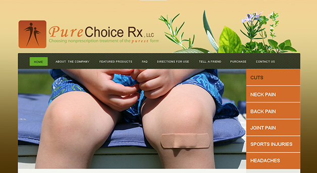
With colors selected a designer went to work to create a logo that combined colors selected with the look and feel that best represented the “natural appeal” of Pure Choice. The overall logo concept for Pure Choice included an icon, which is a graphic depiction that is included in the logo design and a tagline, which is a short description of the company’s message. We created two figurines with arms backwardly out casted as if they were wings with both figurines facing each other, against a “burnt” orange background of color. The selected tagline, using both green and orange colors, reads, “Choosing nonprescription treatment of the purest form”. Multiple colors were also used in the name of the company in the logo, the word “Pure” is orange and the “Choice RX, LLC” lettering are all brown in color.
Next came the creation of business cards. These days business cards have become commonplace, almost expected and if you don’t have one you must not be serious or considered creditable. It is with that understanding that NicheLocal custom designed Pure Choice™s business cards. Our expert designer in keeping with the logo colors, look and feel, created elegantly crafted business cards that retained the natural warmth and balance of the company’s envisioned image.
Finally with colors, logo and a full understanding of the message and image Pure Choice wanted to establish and project, NicheLocal set its attention to designing, developing and launching a tailor-made website. With a fully-engaged owner, NicheLocal first designed the Home and About the Company pages for preview. Upon seeing the sparse content laid out on these preview pages, NicheLocal suggested the adding of an image of the business owner, descriptions and images of some of the natural ingredients found in Pure Choice’s products. All suggestions were added to website, with the consent of website owner.
Because Pure Choice was partnering with a company to provide ecommerce, NicheLocal not only got to develop a website that it launched live, but it also got to develop a replica of the website and turn it over to Pure Choice’s business partner to manage and operate all ecommerce transactions. NicheLocal designed and developed two websites for Pure Choice, both with a single mission to establish web presence.
Powered by NicheLocal, mission accomplished!